
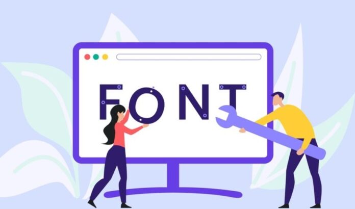
Creating a website is an intensive process that requires a lot of choices and considerations. From writing excellent content to selecting the perfect visuals, the chances are high that you can miss one or two things. Of course, that is common, but one thing you don’t want to ignore is your website’s fonts.
The choice of your website font determines the mood and atmosphere of your site. It is an excellent way to attract readers’ attention and offer them visual clues about your text. Furthermore, it determines how long website users take to read an article, so selecting the right font is one way of improving the user experience.
However, with the many options for your websites to choose from, making a final decision can be tricky. Check out EditorX for the different website and follow this guide on picking the best fonts for websites.
Get Inspirations
The chances are that you already have a few font styles to pick in mind. But before you make any decision, it doesn’t harm to spend time looking at what other people are doing. Don’t let the obsession with uniqueness make you choose an unsuitable font.
The internet today is filled with inspiration websites with endless recommendations. Checking out what top-rated websites have will spark your creativity and give you an excellent font style for your website. It ensures that you select a type that matches your project scope without compromising readability.
Your Personality and Branding Matters
Simply having a limitless choice of fonts on the web is not a guarantee of perfection. In fact, this alone is enough to get things even overcomplicated, especially when you don’t know where to start. For this reason, it is a great idea to consider your brand’s purpose and the target audience carefully. Some things to consider include how you want your users to feel when they visit the website.
Do you want the site to feel serious, playful, or high-end? Or do you prefer to emulate a friendly atmosphere? Whether you go for a sophisticated, trendy, or rugged site, the fonts you pick should reinforce your personality and brand.

Less Is Better
When building a website, you can be tempted to use multiple typefaces in a single design. The sad truth is that this often leads to an overwhelming and cluttered interface. It is recommended that you start your fonts with a single typeface since they work harmoniously together. Not only that but going this route will give your interface a more robust and cohesive look.
If you have to use more than one font style, please limit yourself to three at most. But sticking to one is the best option for you because, after all, most fonts come with a wide range component to ensure variations for various purposes. For instance, some of them include italics, bold, extended and condensed options.
Take your time to understand the different types of fonts and where they suit best.
For example, primary font is best suited for the heading and other larger texts like the logo. This is a chance to showcase your creativity and be a bit daring to make it the most visible font on the page. On the other hand, secondary font is meant for the body of your text. Make it simple and readable.
Use the accent or tertiary font for the navigation menu, call to action, and other website navigation elements. The accent font should be creative, and big enough to catch users’ attention. But don’t make it too dramatic to avoid clashing with the primary font. Also, ensure it complements the secondary font and the rest of the page elements.
Readability is Key
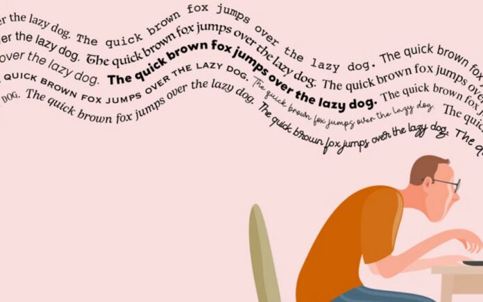
Another consideration worth noting when choosing your fonts is readability. It should be the number one priority because the idea of creating content is for people to read them. This is not to endorse or suggest a font for you, but some of the most popular in terms of readability include Times New Roman and Georgia.
These are the perfect options to start with, especially if you prefer the serif fonts for your aesthetic. On the other hand, sans-serif fonts are also good since they have a more modern and clean design. Arial and Helvetica are examples of sans-serif fonts with excellent readability.
Check Scalability
Some typefaces have better visibility when scaled to larger sizes. On the contrary, others are perfectly fine in smaller settings. Scalable fonts are vital when incorporating typography on your website. With scalable fonts, you can increase or reduce their sizes without any distortion. In addition to the numerous sizes of each font, the scalable options can give the best output on a device.
Devices with excellent resolutions will give a scalable font a better look. As a rule of thumb, go for a typeface compatible with multiple screen sizes and with different devices. This brings the aspect of ensuring your website is responsive and compatible with mobile and desktop devices.
The Font Load Time
Most designers overlook the fonts’ load time, but it is critical. When selecting a font style for your website, go for a web browser friendly choice. Today, very few people have the patience for slow-loading things. You are definitely on the list, so you cannot afford to treat your website users any different.
Some commonly used Google fonts can work perfectly in a browser without issues. When choosing your web fonts, go for enough character sets and styles. This is an excellent way to avoid excess weight that can slow your site.
Final Words
On top of gorgeous-looking graphic design elements for your website, topography makes up more than 80% of the content. For this reason, your font style must never be overlooked, as it can have a direct influence on user experience. When selecting a font design that works best for you, consider the design purpose first. Getting inspiration from others is a good starting point. And above anything else, ensure the typeface works excellently on different devices and screen sizes.


