
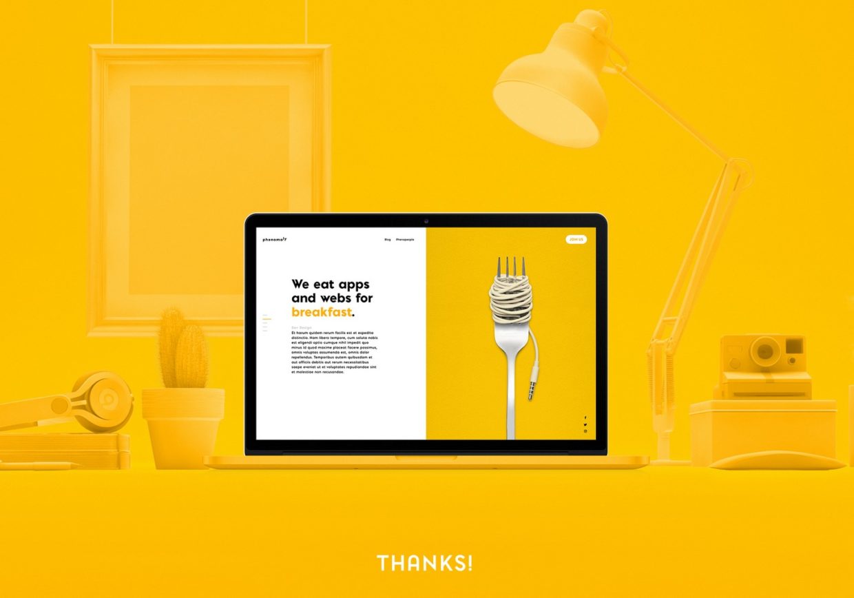
When you build a website for your business, your focus is usually colors, images, fonts, videos, logos, and things like that. Then, there is something called white space or negative space in web design that makes your web pages look clean and clutter-free. Too many design elements thrown all together confuse your visitors and cause much distraction. Remember your site visitors look for information, both text and visual, but not a kaleidoscope of designs and patterns. That is the reason why professional web designers in Seattle focus on white space more than anything else.
Negative or white space is the gap left between design elements to provide relief to visitors’ eyes. The rationale behind the use of white space in web design is to make users spend more time on your web pages.
According to an article published on Entrepreneur.com, the white space in your web design must look elegant, sleek, as well as user-friendly. Many brands in Seattle are making the most out of negative space. So, why not you? Here are five reasons to include it in your web pages:

1. Sets the tone of your website
Did you know that white or negative spaces help in communicating your brand message simply and clearly? It brings out the sophistication in the design that you have created for your site. The more the negative space, the more improved and classy your web page design will look.
White space also improves your brand positioning and enhances reading and comprehension, according to some findings by Wichita State University. You can look up websites online that make the best use white spaces. Take inspiration from them but do not directly copy their style.
When you embrace this design style, you’ll be able to nurture a minimal design aesthetic and display graphics in a stunning, beautiful way. Modern internet users like elegance and not noise in your design. The information they read should be easy to read for their eyes. On the contrary, if you have a messy home page, your visitors will abhor it and leave your website in no time, thus leading to increased bounce rates affecting your rankings.
Therefore, design a minimalistic website with lots of white space to pique audience attention and make them stay longer on your home page or other pages for that matter.
2. Easy readability
To be honest, whitespace could significantly help you to improve or damage the readability of a particular web page. When you have web copy or information on the web pages, you should make certain that it includes a small font taking up the least amount of whitespaces. You can easily add to the tracking and leading to make your web pages legible.
Thrive.design explains this point with the help of an example. If you have seen the print version of the Wall Street Journal, the pages have numerous text columns with the least number of margin spaces; this does not happen when you design a website. The spaces and margins are deliberately used to make the content or copy easily readable for your visitors. The professional web designers in Seattle make sure there is enough white or negative space for easy legibility.
3. Speeds up interaction
You might be wondering what we’re discussing at this point. Well, let us explain. There is enough evidence to support that white space improves interaction. It helps your visitors to figure out which part of the website they should navigate next and what action they must take. In simple words, white space helps your visitors to reach their destination page while at the same time gives them a reason to click the buy button, inquire more about products, or download an eBook. Therefore, never integrate too many elements into your site, as in doing so you will end up annoying or frustrating your website users.
Never give your visitors the reason to leave your home page in disgust because of a messy and cluttered design and click on your competitor’s website link. Add fewer design components to highlight the most significant information on your web pages. The best way to do it is by adding white space around the design elements. Make sure your web design does not distract but grab user attention to things or information that matters.
4. Piques visitor attention
White or negative space involuntarily helps to pique visitor attention or interest, who land on your home page or product page for some information. For example, if you find some precise elements such as a copy or picture that calls for user attention, include a little white space around those components. This way, visitors will stay on your site.
It is quite beneficial when you try to sell products through your website. For example, when you have a product image and sell some discount coupons, incorporate a little white space around the elements to pique audience interest.
5. Easy understanding
What makes reading simple and easy? You would like to stay on a web page that has adequate breathing space between text, sentences, and paragraphs. The same applies to your website users. You will usually leave a page if you see the text too close to each other and with no breaks in between paragraphs or sentences through white or negative space.
Even if you read a cluttered page, the topic might not be easily understandable because of the messy design sans white space. After a few minutes, you will feel annoyed and leave that website because it leads to much strain to the brain and eyes.
That is the reason why white space gives your website visitors a better understanding of what information they read and comprehend.
Conclusion
Seasoned web designers in Seattle create stunning web pages, tabs, menu options, links, and graphics. Besides, they include an essential element, which is white space around the most important design element for easy readability and comprehension. Call-to-actions or CTAs also need white space around them to let visitors take some action, might be subscribing to your email newsletters or product inquiry.


